Sprucely.io provides visual data analytics as a service
. It is a flexible platform service that automates your data insights pipeline. It takes data from many sources to create interactive decision intelligence. In seconds.Built on modern web architecture, Sprucely.io is a service that sanitize, store and present your data as powerful dashboards. It will seamlessly serve interactive data visualization elements. But Sprucely is a lot more. It automatically generates data intelligence based on the context you provide. It offers easy no-code integration with favourite business applications such as Powerpoint, and low-code integration with other web services.
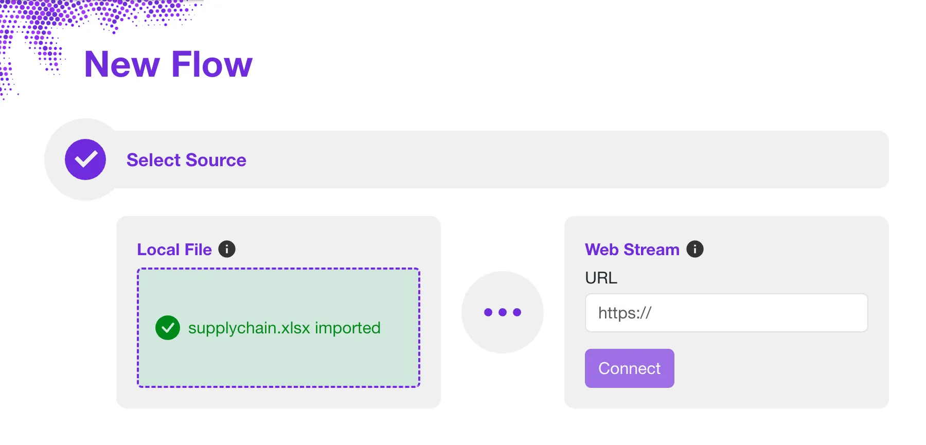
The journey starts with a New Flow, the guide that automatically generate dashboards from your data. Here's how it works...
Select Your Data Source
The flow starts by defining the source of data. You can import a local data file for storage in the Cloud or On-premise. Alternatively, reference data can be downloaded directly from a regular HTTP request. This includes JSON data served dynamically by other systems.
Defining a stream requires no additional storage in Sprucely. Any request to view the dashboard will directly pull the latest data from the source.
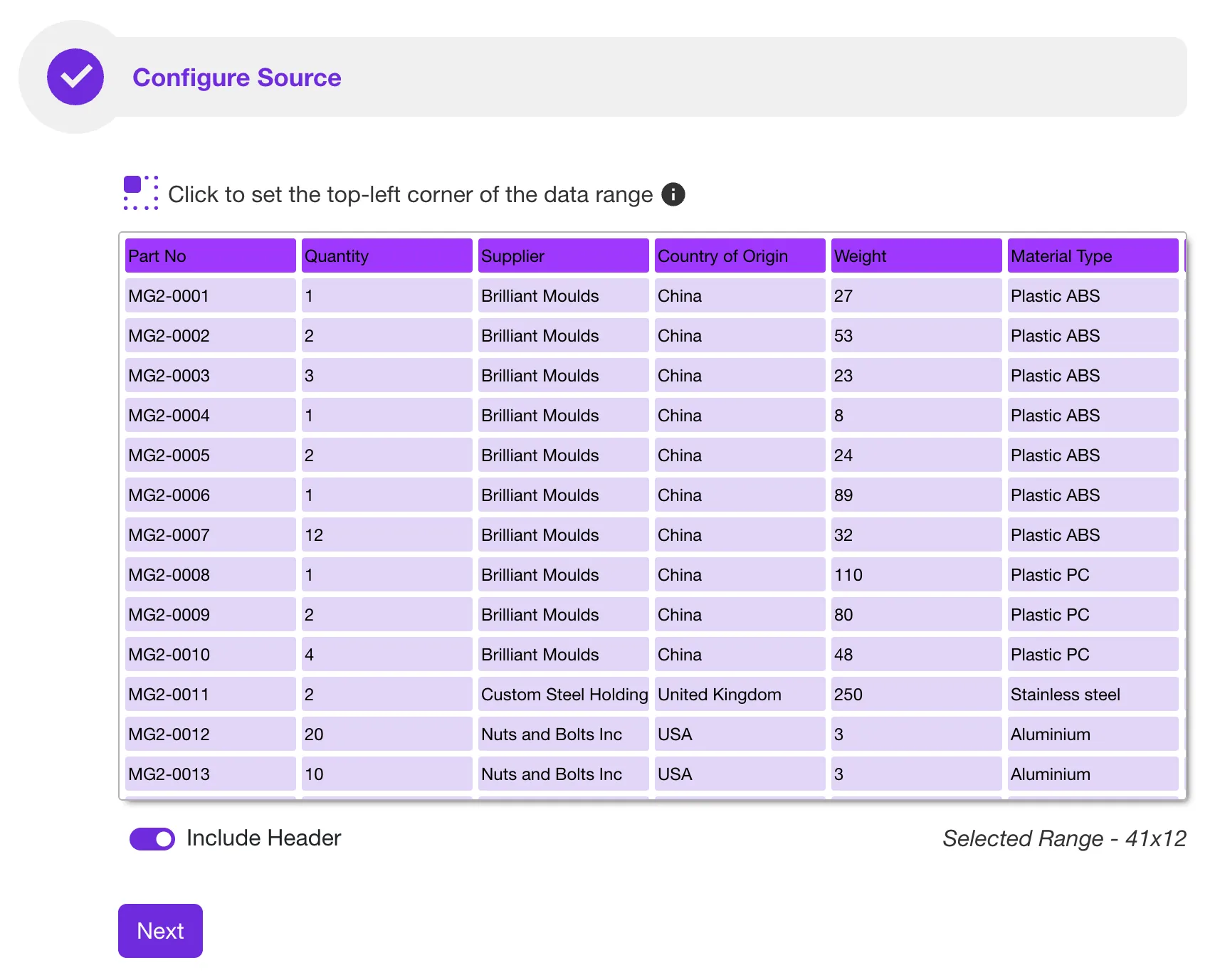
Configure Your Data Source
Sprucely automatically analyzes data when your source is not in a fixed database format. For example, it auto-detects the most suitable region of a spreadsheet for import.
Sprucely will present you with the suggested data region and column headers of the data to import. Before proceeding, it will allow you to make any modifications if desired.
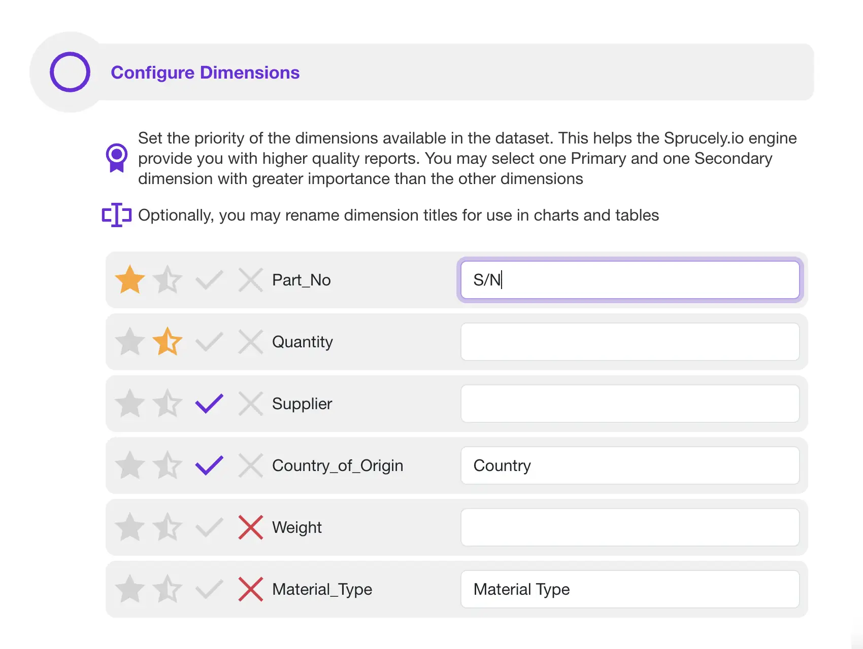
Define Your Priorities
To ensure high quality decision intelligence, you can provide optional cues. Tell Sprucely which data columns are most relevant to your specific report.
This input allows Sprucely to optimize data insights. It also automatically generates a report that is more relevant to your needs.
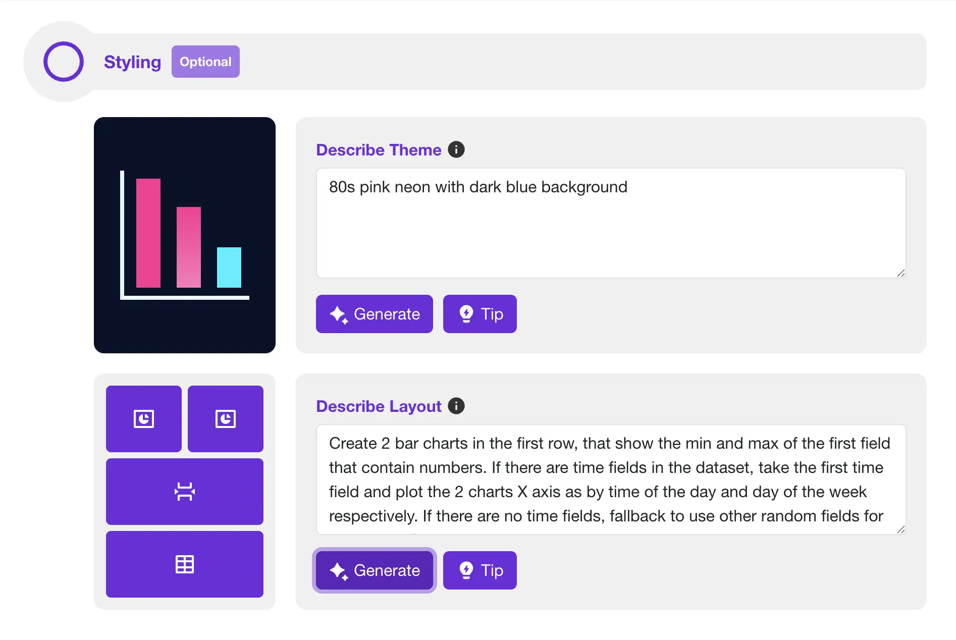
Let AI Generate Your Dashboards
Sprucely's AI assistants help you automatically generate spot-on dashboard layouts. They also create complex chart setups from free text descriptions, saving you time.
Use the theme assistant to create a unique color theme. Base it on your branding guidelines, color themes, or contrast rules.
The layout assistant is a powerful AI tool for describing dashboard layouts. Use it to compose charts and widgets, and individually set their applicable settings. It also knows your data types. The assistant automatically matches and configures the most suitable chart to fit your request.
Sprucely.io's AI even excels in automatically generating dashboards with more advanced features, such as breaking down data by time seasonality.
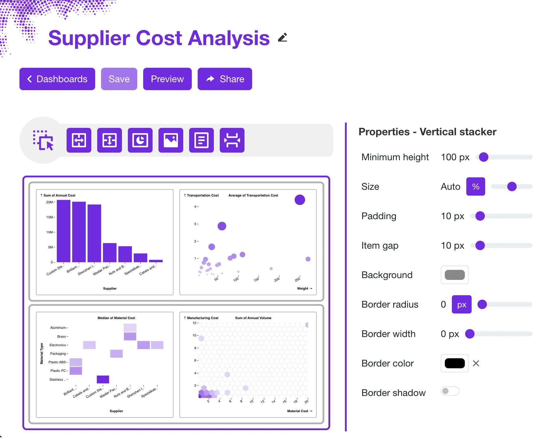
Customize Your Dashboard
Sprucely will auto-generate a dashboard for you based on the data source and the preference cues you have provided. It's easy to tailor the dashboard to your needs with the visual editor.
Using simple drag'n drop actions combined with layout widgets you can modify the dashboard layout exactly the way you want. You can also customize both function and style accordingly for all the widgets in the dashboard.
Sprucely supports embedded charts with interactive cross-filtering. The data pipeline also allows you to reference input from multiple data sources at once. This allows you to create more complex dashboards with views from multiple data sources combined into one unified report.
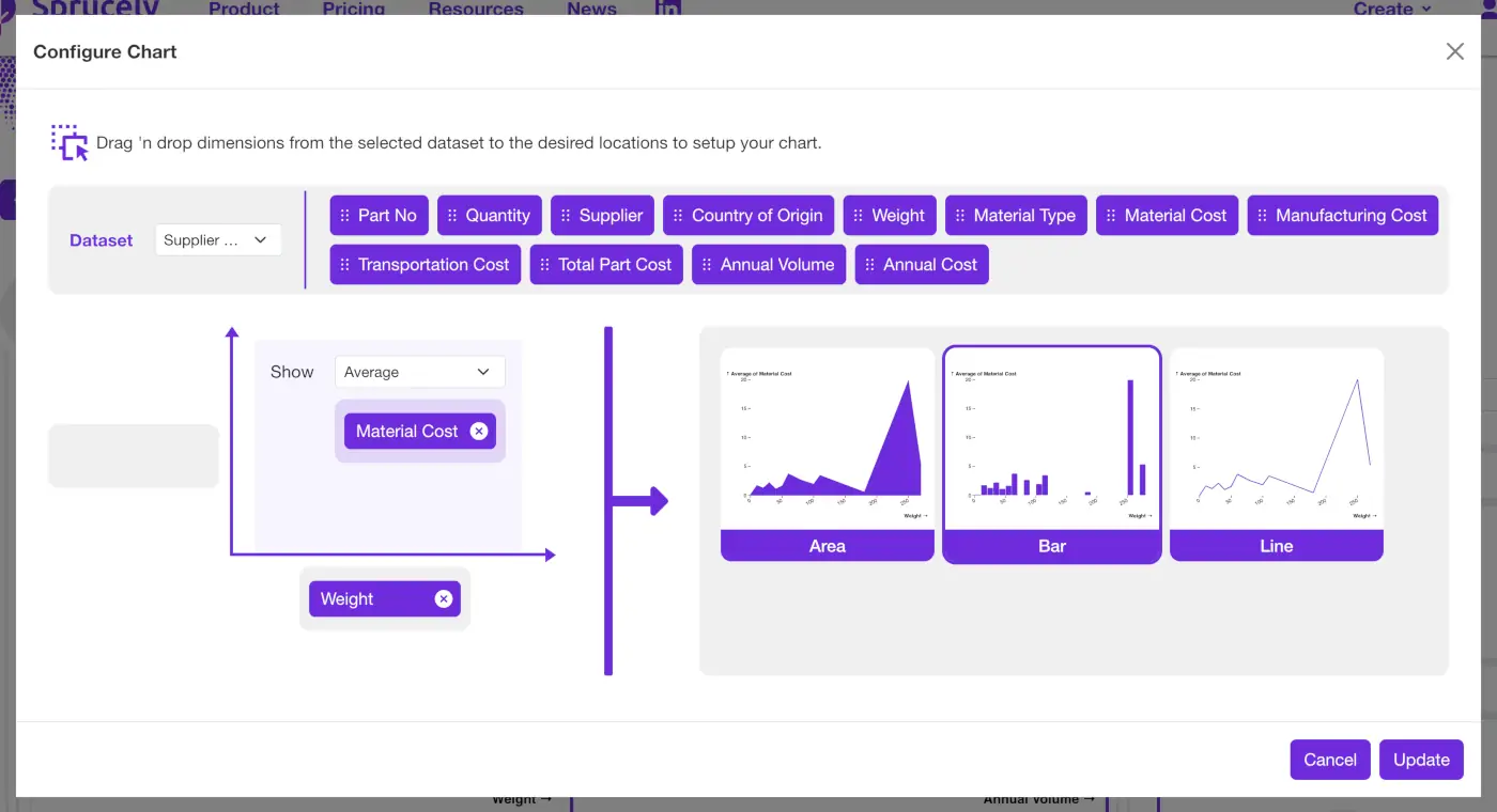
Configure Charts
Sprucely comes with an intuitive chart wizard that simplies the process of setting up your charts in your dashboard!
The wizard uses a simple drag 'n drop mechanism. Pull different data dimensions to your chosen chart axis and configure data aggregation. Based on your inputs, the wizard recommends suitable chart types. It proposes charts that support your specific data and settings.
Instantly evaluate how your data renders with different chart types in the wizard. Then select the option that fits your need.
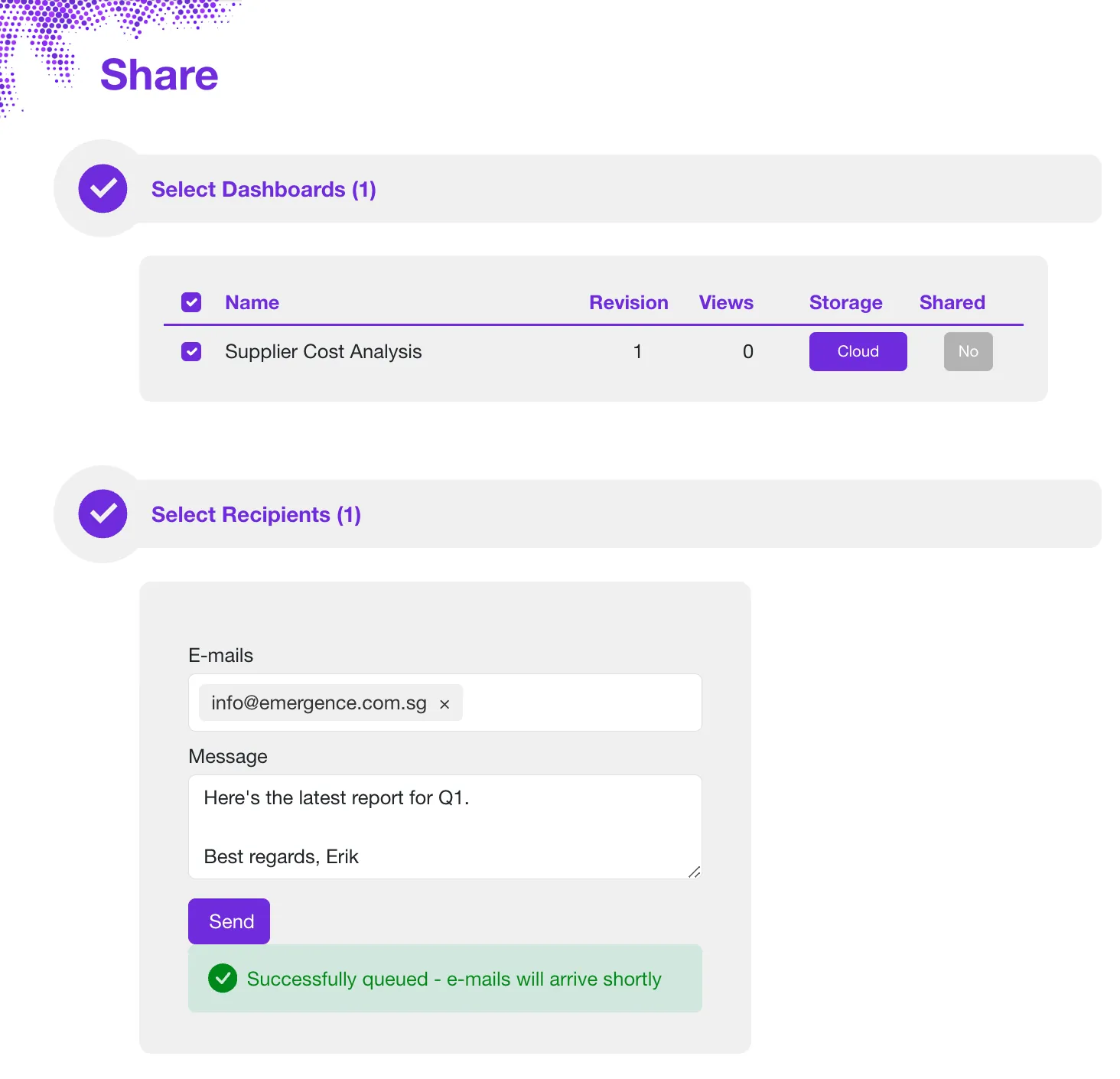
Share Your Dashboard
Store the dataset and dashboard on the Cloud or in your own network. You can then share the dashboard directly via e-mail.
Share your data intelligence reports through many integration options. Embed them into web pages, presentations, or documents using our Connector applications.