
Summary
What you will learn in this detailed guide using Sprucely.io:
- Convert Excel (or JSON/text data from files or web streams) into an interactive dashboard in seconds.
- Connect or upload your data, optionally configure ranges and dimensions, then let AI generate charts and layouts automatically.
- Installing the Sprucely Powerpoint add-in, and setting up live interactive dashboards in your PowerPoint pages.
- Supports live data, cross-filtering, and multi-dimensional charts for interactive analysis - directly in PowerPoint presentation mode.
Watch the Video
This video gives an introduction to Sprucely.io and how you can import data to create a Sprucely.io dashboard. Detailed instructions follow the video.
Sprucely.io introduction and how to create an interactive dashboard from Excel (1:25 mins)
Creating a Dashboard from Excel Data
The first step to building a PowerPoint dashboard is turning your raw data into a visual layout. We will use a sample Excel file from Sprucely.io’s website to walk through the flow from data to dashboard. You can also use JSON or text files, or define a web stream source for live data analysis.
The flow follows the recommended way of importing data into Sprucely and generating a dashboard template automatically. You get a working dashboard for use with PowerPoint that you can customize — charts, layout, and styles — to fit your needs.
Instructions:
- Login to Sprucely.io - Open a browser and surf to www.sprucely.io. If you have not yet done so, go ahead and login.
- Create a new flow - Go to the Create New Flow page, accessible from the top-right menu.
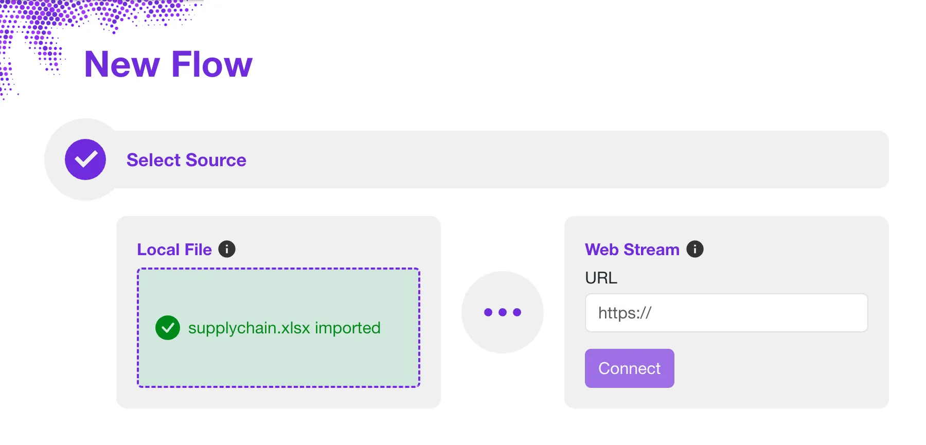
- Select source - We will use a web stream source for our example. Our sample Excel file is served directly from the Sprucely.io web server. In the Web Stream section, input the URL https://www.sprucely.io/supplychain.xlsx and click Connect. If you have a local file, drag and drop it from your File Explorer. Alternatively, select the file from the filesystem in the Local File section.
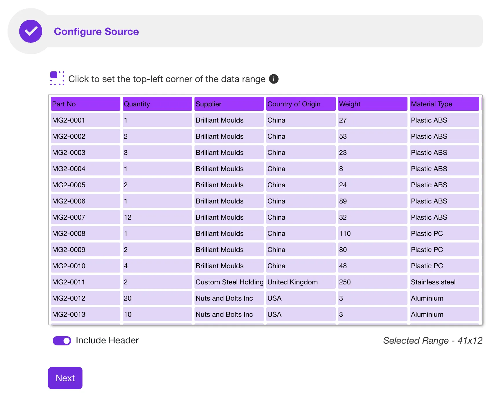
- Configure source - In this step you can manually decide which data range to import from your data source. This is useful for importing a subset of the data. Use it to choose a specific sheet if your Excel document has multiple sheets. No configuration is required if you use our sample file. Sprucely.io automatically detects the ideal data range to import. Click Next to continue.
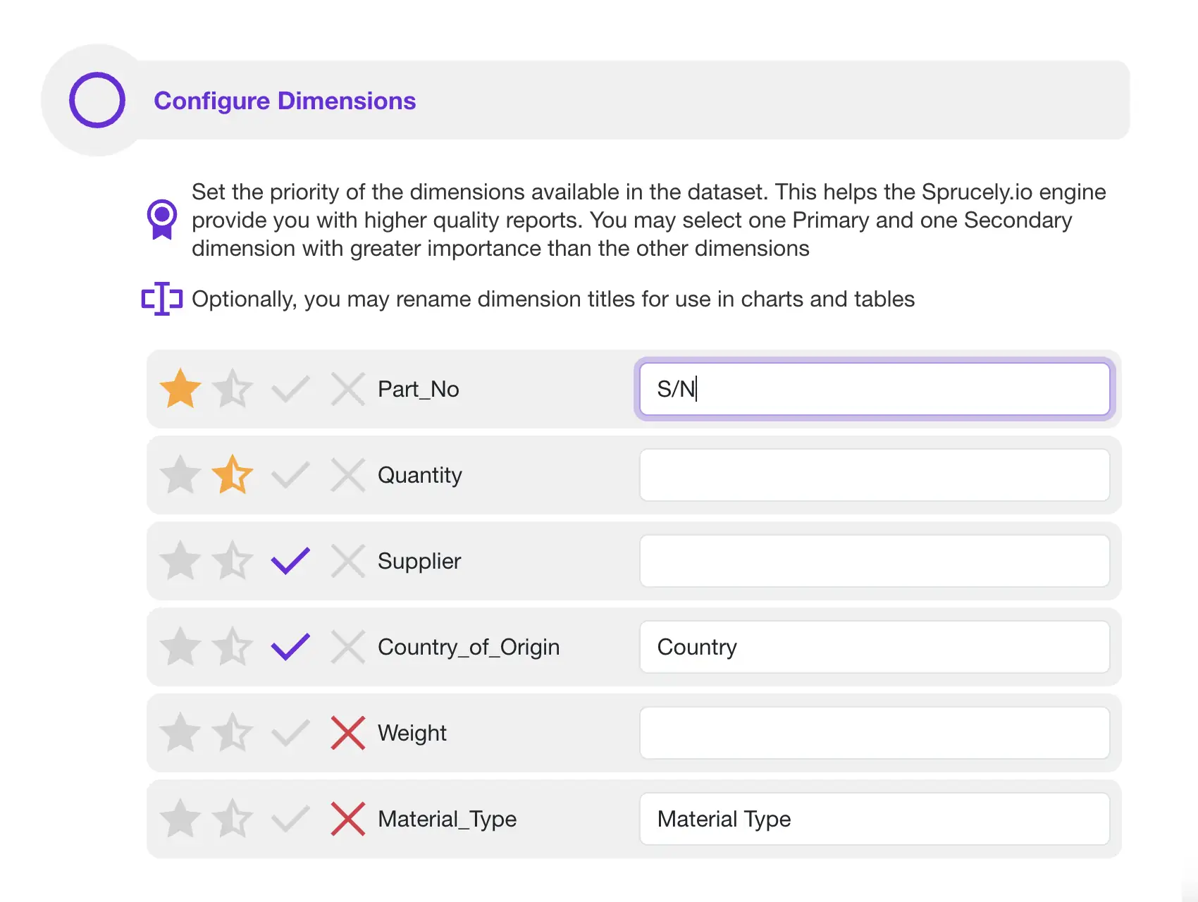
- Configure dimensions - Give cues to Sprucely.io’s insights engine and dashboard generator by setting priorities in this step. If you are using our sample file, there is no need to modify any of these settings. Click Next to continue.
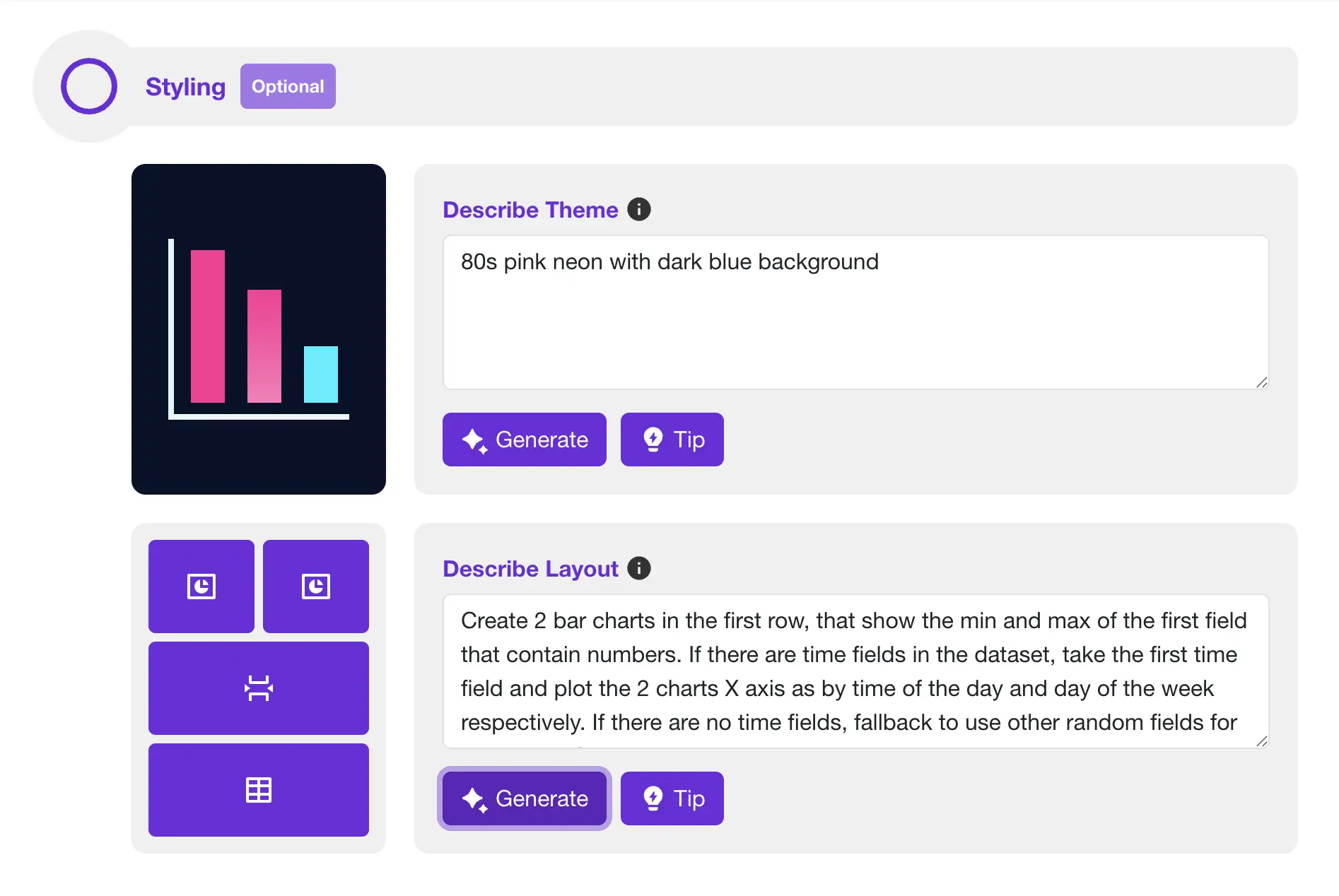
- Let AI build your dashboard - Use free-form text to describe your preferred color theme. You can also describe the layout and charts data presentation. Simply describe what you would like to see, and click Generate to have Sprucely.io’s AI build it directly for you.
- Generate dashboard - Set a title of your dashboard and click Save to generate the dashboard template. Once completed, you are automatically routed to the dashboard editor page. You can modify the dashboard if you desire.
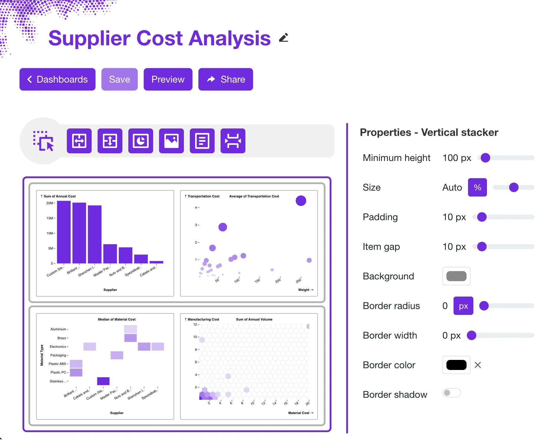
Embedding an Interactive Dashboard in Powerpoint
Once your dashboard is ready, embedding it in PowerPoint takes just a few steps. The embedded dashboard stays interactive — you can filter, and cross-compare the data during your presentation. No static screenshots needed. This gives you a true dashboard in PowerPoint, not just an image.
Pushing dashboards from Sprucely.io into PowerPoint requires no downloads or application setup. The Sprucely.io add-in for PowerPoint is available in Office 365 and works with any recent desktop version of Microsoft Office.
The following video highlights the key flow. Alternatively, follow the detailed instructions below.
This video showcases how you can embed a Sprucely.io dashboard with the Powerpoint add-in (1:10 mins)
Instructions:
- Login to Sprucely.io - Open a browser and surf to www.sprucely.io. If you have not yet done so, go ahead and login.
- Find the dashboard to embed - Go to the Create Dashboards page. It is accessible from the top-right menu. Find the dashboard to embed into Powerpoint from the list.
- Ensure the dashboard is shared - Ensure that your dashboard is published. If so, the Shared column will indicate Yes for this row. If not, select this dashboard entry. Click the Share button at the top of the table and follow the instructions.
- Copy the dashboard link - In the Dashboards page, click the icon in the row of your selected dashboard. The link is now copied to the clipboard.
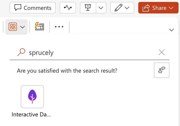
- Add a Sprucely.io PowerPoint add-in to your slide - In PowerPoint, find the Add-ins toolbar entry and click it. A dropdown dialog appears, including a My add-ins section. The Sprucely.io add-in is listed there for quick access after its first use. If you have not used the Sprucely.io add-in before, just type “sprucely” in the Find an add-in… search field and click on it when you find it. A new Sprucely.io object is automatically inserted into your current slide.
- Insert the link into the PowerPoint add-in. Now paste the dashboard link (using Ctrl+V) into the Dashboard URL field. Press Save to complete the action.
- You are ready to go!

Conclusion
We have shown how to build and embed interactive dashboards in your PowerPoint presentations in two steps. First, use Sprucely.io to create a dashboard from your Excel data that can be shared.
Then you can create a PowerPoint dashboard for your team by loading the Sprucely.io PowerPoint add-in and embed the dashboard directly in your slide.
This approach gives you a dashboard PowerPoint template you can reuse and customize. Present multi-dimensional charts and interact with data live during your presentation. Use cross-filtering and group filtering to drill down on specific segments. This works well for sales reviews, project updates, financial reporting, or any scenario where your audience needs to see the numbers up close.
If you want to learn more about dashboard designs and layout principles, see our guide on creating effective dashboard designs in PowerPoint. For teams that use Google Slides instead of PowerPoint, many of the same data preparation steps apply — the main difference is in how you embed the final dashboard.
Sign up for free with Sprucely.io to get started. You can also check out our getting started guide or compare subscription plans first.
This article was first published 16th July 2024.

Frequently Asked Questions
Question: What data sources can I use to create a Sprucely.io dashboard?
Short answer: You can import data from Excel files, JSON or text files, or set up a web stream for live data analysis. The guide’s example uses a web stream pointing to Sprucely’s sample Excel file (https://www.sprucely.io/supplychain.xlsx), but you can also drag-and-drop a local file or select it from your filesystem.
Question: How do I create a dashboard from an Excel file in Sprucely.io?
Short answer: Log in to Sprucely.io, create a new flow, choose your data source (e.g., the sample web stream URL or a local file), optionally configure the range/sheet, set dimension priorities if needed, then generate the dashboard by giving it a title and saving. Sprucely auto-detects the import range for the sample file and routes you to the editor where you can customize charts, layout, and styles.
Question: Do I need to install anything to embed a dashboard in PowerPoint, and which versions are supported?
Short answer: No downloads or app setups are required. Use the Sprucely.io PowerPoint add-in available in Office 365; it works with Microsoft 365 Cloud or any recent desktop version of Microsoft Office. You can find it via the Add-ins toolbar (search “sprucely”) and it will appear under My add-ins after first use.
Question: How do I publish and insert my Sprucely dashboard into a PowerPoint slide?
Short answer: In Sprucely, go to the Dashboards page, ensure your dashboard is published (Shared = Yes), and copy its link. In PowerPoint, insert the Sprucely add-in, paste the link into the Dashboard URL field, and click Save. Your slide now contains a live, interactive dashboard.
Question: What interactivity and customization are available once embedded?
Short answer: The embedded dashboard stays live and supports item selection and cross-filtering, so you can drill into segments during presentations. You can also customize the dashboard’s charts, layout, and styles in Sprucely, making it a reusable template for reviews and reporting. For Google Slides users, the data prep steps are similar, but the embedding method differs.