

Sprucely.io turns an Excel file into an interactive dashboard you can publish and share. Upload the spreadsheet and your Excel dashboard is generated from the data — charts, layout and colour theme — with no formulas to write, no PivotTables to wire up, and nothing for your colleagues to install. Every chart filters every other one, so readers explore the numbers themselves instead of asking you for another cut of the report. This guide covers both, plus examples of what the finished result looks like.
The how-to shows that flow first, then walks through building the equivalent dashboard by hand in Excel with PivotTables, PivotCharts and slicers, so you can judge which route fits the report you need. If you have never made a dashboard in Excel before, reading both is worth the ten minutes — the manual method explains why the automated one is shaped the way it is.
Summary
What you will learn about building Excel dashboards:
- Turn the raw data in an Excel file (or JSON, text, or a web stream) into an interactive dashboard, without building PivotTables and slicers by hand.
- Connect or upload your data, optionally set the range and column priorities, then let AI generate the charts and layout.
- Customize visuals, themes, and layout in the editor, then share by link — recipients install nothing.
- Build the same dashboard manually in Excel, using PivotTables, PivotCharts, slicers, and Report Connections.
- Understand cross-filtering, and where Excel’s slicers run into limits.
- See Excel dashboard examples before you build, so you know what a finished one should look like.
Watch the Video
This video gives an introduction to Sprucely.io and how you can import data to create a Sprucely.io dashboard. Detailed instructions follow the video.
Sprucely.io introduction and how to create an interactive dashboard from Excel (1:25 mins)
Create an Interactive Excel Dashboard in Seconds
Follow these steps to import your spreadsheet and generate a dashboard from it automatically.
We will use a sample Excel file from Sprucely.io’s website to walk through the full flow. You can also use JSON or text files, or define a web stream source for live data analysis. The flow follows the recommended way of importing data into Sprucely and generating a dashboard template automatically.
Select your data source, configure the import, and let Sprucely.io build the dashboard for you. The result includes line charts, bar charts, heatmaps, scatter plots and tables, chosen to fit your data structure. You can then adjust the layout and charts as needed.
Instructions:
- Step 1: Login to Sprucely.io - Open a browser and surf to www.sprucely.io. If you have not yet done so, go ahead and login.
- Step 2: Create a new flow - Go to the Create New Flow page, accessible from the top-right menu.
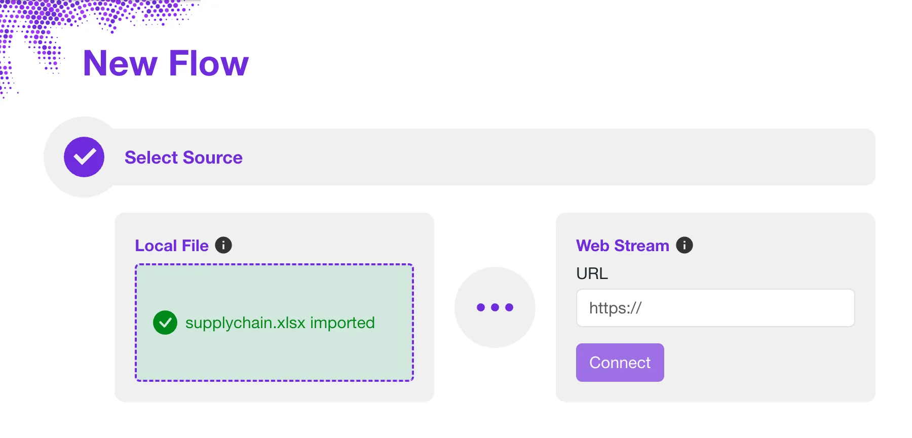
- Step 3: Select source - We will use a web stream source for our example. Our sample Excel file is served directly from the Sprucely.io web server. In the Web Stream section, input the URL https://www.sprucely.io/supplychain.xlsx and click Connect. If you have a local file, drag and drop it from your File Explorer. Alternatively, select the file from the filesystem in the Local File section.
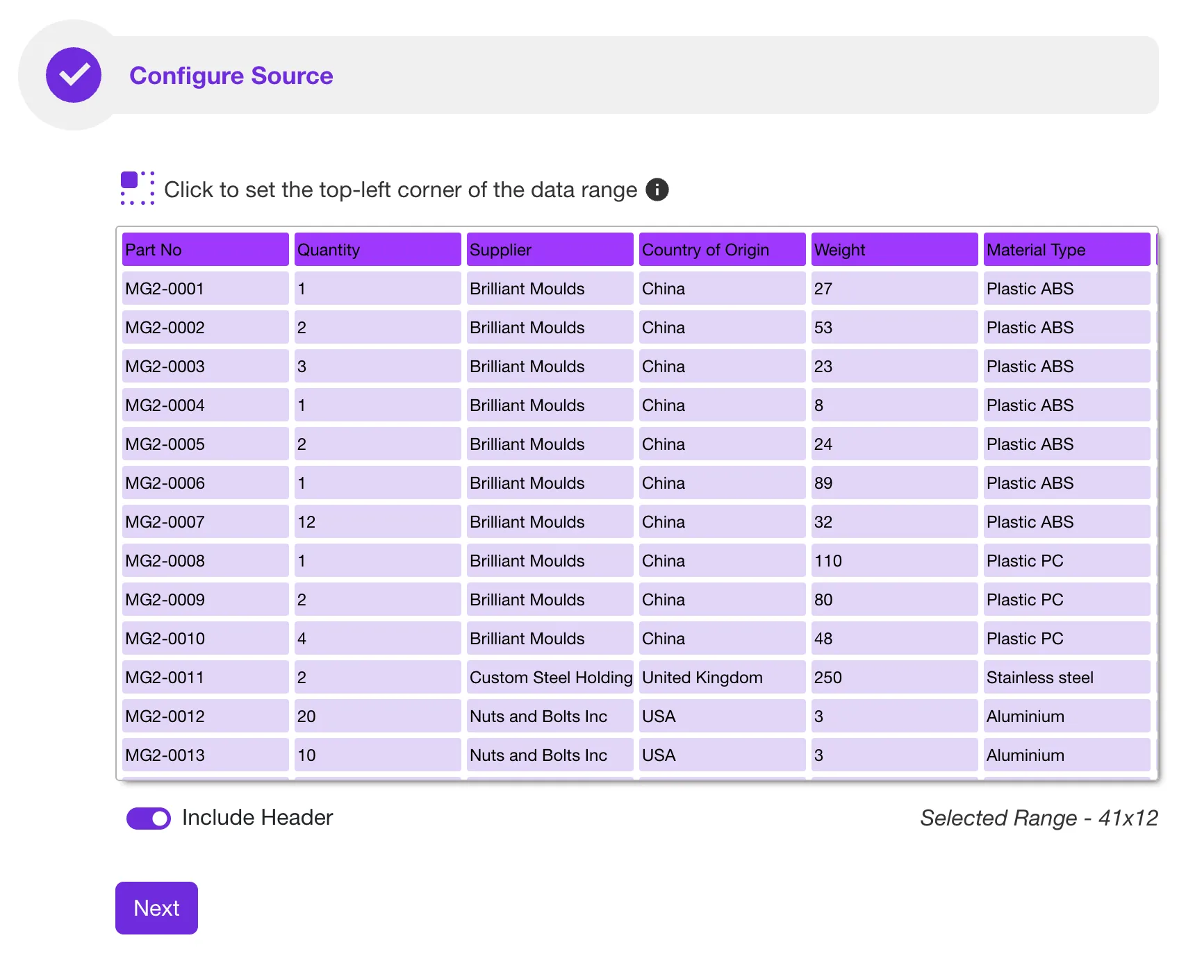
- Step 4: Configure source - Here you decide which data range to import. This matters if your workbook has several sheets, or if your data does not start in cell A1. The same rule applies as when building a PivotTable by hand: the import works best on a contiguous range with a single header row and one row per record. No configuration is required for our sample file — Sprucely.io detects the range automatically. Click Next to continue.
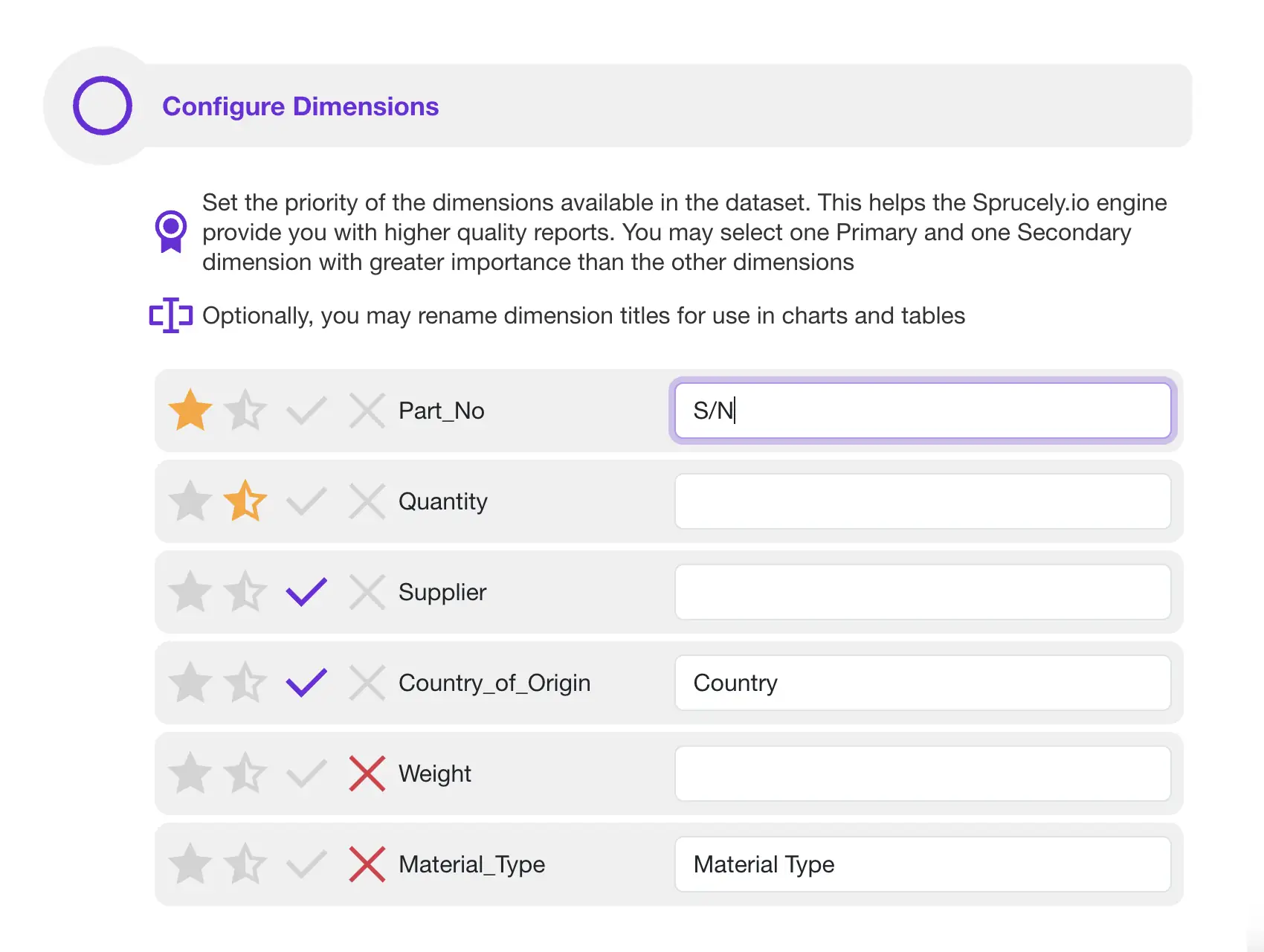
- Step 5: Configure dimensions - Set priorities on your columns to tell the dashboard generator which ones matter most. This is the equivalent of deciding, in a manual build, which fields belong in Rows and which belong in Values. If you are using our sample file, there is no need to modify any of these settings. Click Next to continue.
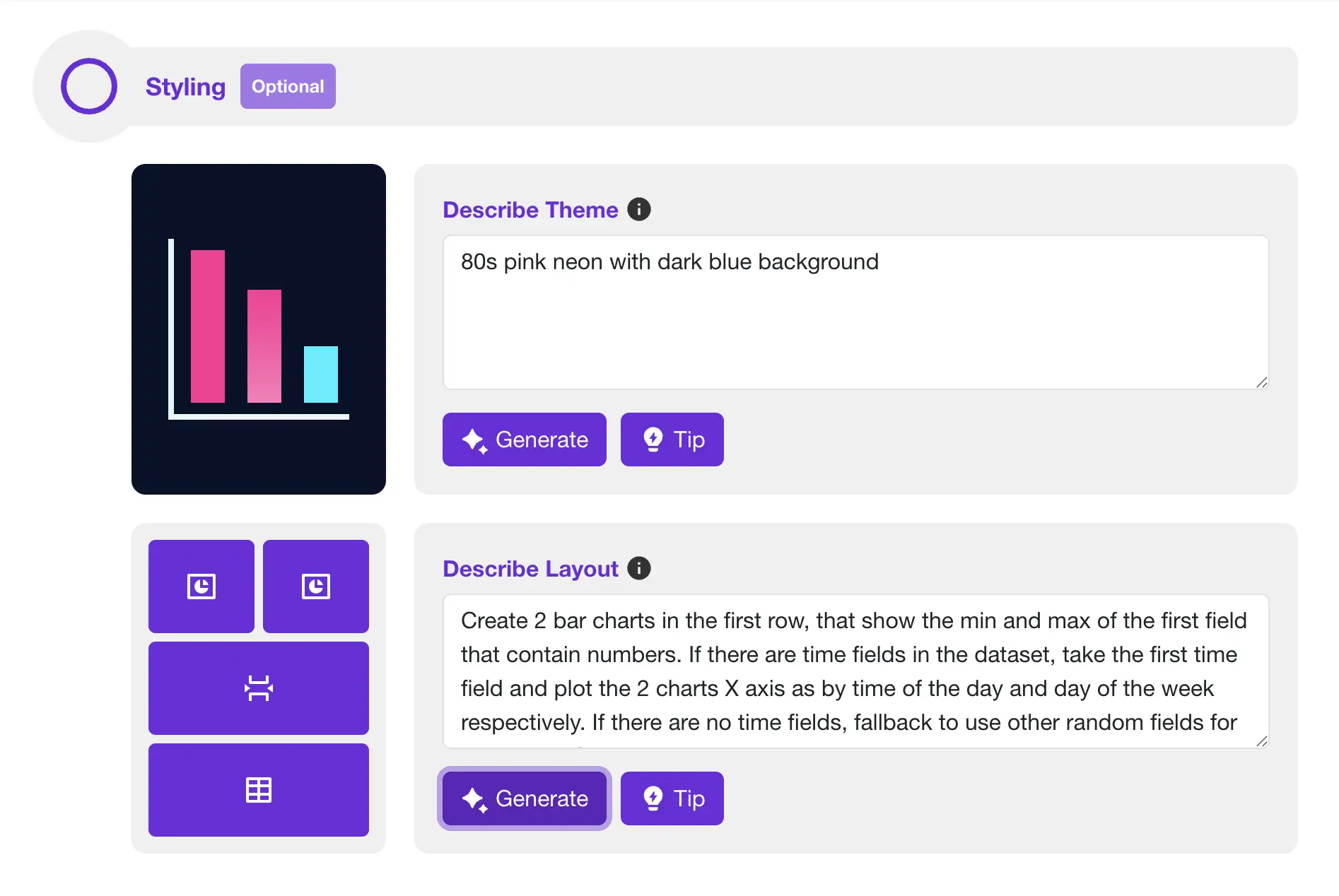
- Step 6: Let AI build your dashboard - This step is optional. Describe your preferred color theme in plain language, and describe the layout and charts you want. Click Generate and Sprucely.io’s AI composes it. If you skip this step, a dashboard is still generated from your data automatically.
- Step 7: Generate dashboard - Set a title for your dashboard and click Save. Once completed, you are automatically routed to the dashboard editor page, where you can modify the result.
Customize the Dashboard
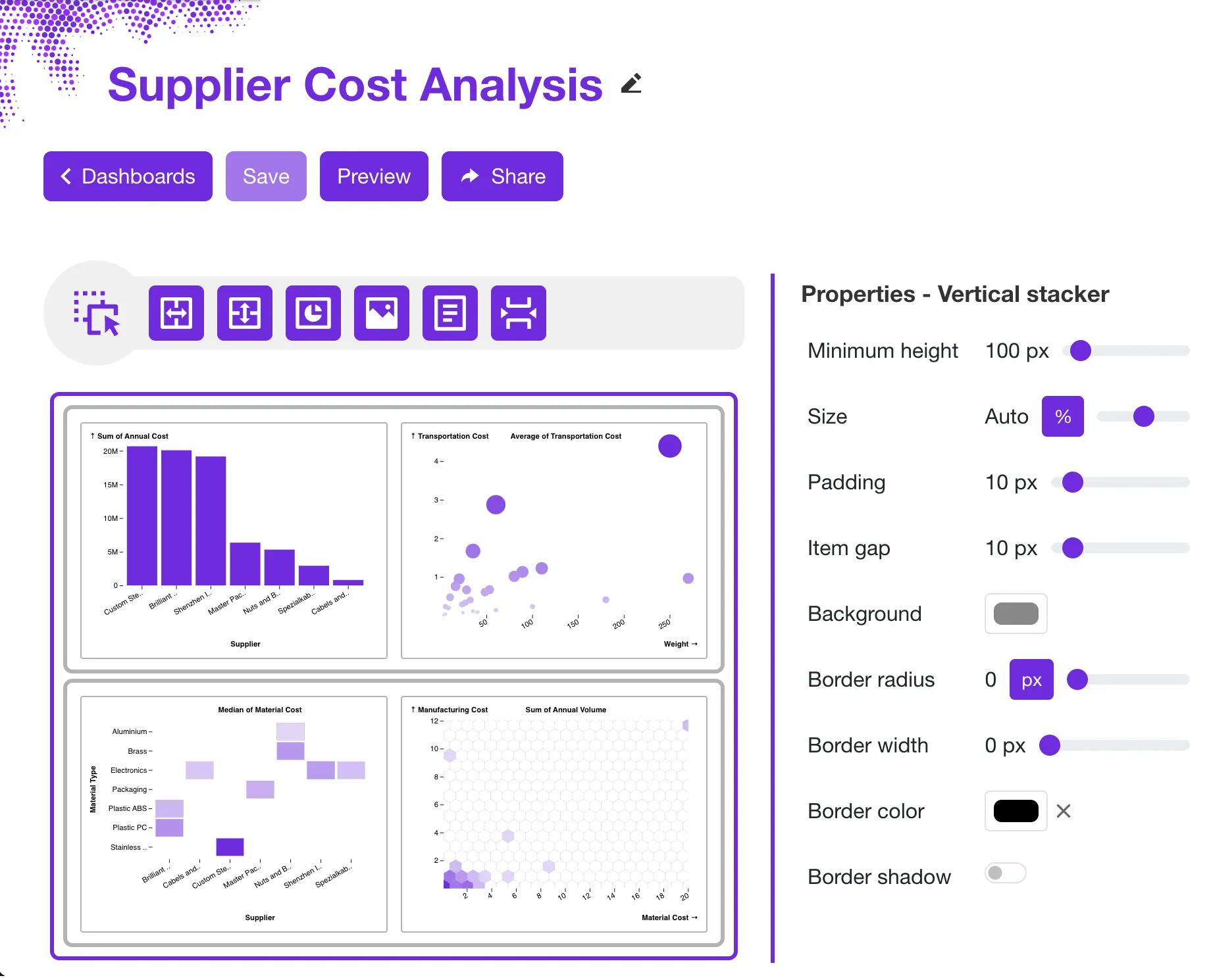
The generated dashboard is a starting point. Sprucely.io lets you customize the layout, colors, style, and data views until the dashboard matches your needs. You can swap chart types — replace a bar chart with a line chart, or use a heatmap to show how two dimensions relate.
Use drag-and-drop to rearrange widgets. Every chart built on the same dataset filters every other chart automatically, with nothing to connect: click a bar, or click and drag across a line chart, and the rest of the dashboard responds. This is the part that takes the most setup in a manual Excel build, and it is covered in detail further down.
Instructions:
- Step 1: Login to Sprucely.io - Open a browser and surf to www.sprucely.io. If you have not yet done so, go ahead and login.
- Step 2: Find the dashboard - Go to the Create Dashboards page, accessible from the top-right menu. Find the dashboard you would like to edit from the list.
- Step 3: Start editor - Press the dashboard name link or click the Edit dashboard button on the same row. This proceeds to the Dashboard Editor.
- Step 4: Change layout - Use simple drag’n drop actions and layout widgets. Modify the dashboard layout exactly the way you want. You can drag new widgets to add to your dashboard from the top action toolbar. Move an existing widget simply by dragging it to the new location.
- Step 5: Color themes - Change the default color theme by selecting a pre-defined theme. You can also customize the color palette. You may also override the default theme by configuring specific colors for individual widgets. Read more about theme support.
- Step 6: Configure charts - Customize function and style for all widgets in the dashboard. Use the options in the properties sidebar. It will always show the options for the currently selected widget (click on a widget to select it). Read more about the chart wizard.
- Step 7: Save - Don’t forget to click on the Save button in the top action toolbar to save your changes.
Sharing the Dashboard with Others
Sharing dashboards from Sprucely.io is straightforward. Send recipients a link by e-mail so they can view the interactive dashboard in their browser — no software install needed on their end. This is helpful when people from different teams or places need to see the same data.
You can also embed the dashboard directly in a slide or document. The free add-ins for Microsoft PowerPoint, Google Slides and Google Docs are listed on our connectors page, and the dashboard stays interactive even in presentation mode.
Instructions:
- Step 1: Login to Sprucely.io - Open a browser and surf to www.sprucely.io. If you have not yet done so, go ahead and login.
- Step 2: Find the dashboard - Go to the Create Dashboards page, accessible from the top-right menu. Find the dashboard you would like to share from the list.
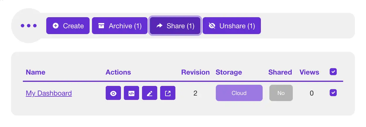
- Step 3: Select and share - Click the checkbox for the dashboard you want to share. It is at the far right end of the row. Now, the Share button in the action toolbar will become enabled and should indicate Share (1). Click the button to proceed.
- Step 4: Select recipients - Your dashboard should be pre-selected from the previous step. Find the submit message form after the selection list. Find the E-mails field and enter at least one e-mail address you would like to send the dashboard to. Optionally, you may also enter a custom message for your recipient(s).
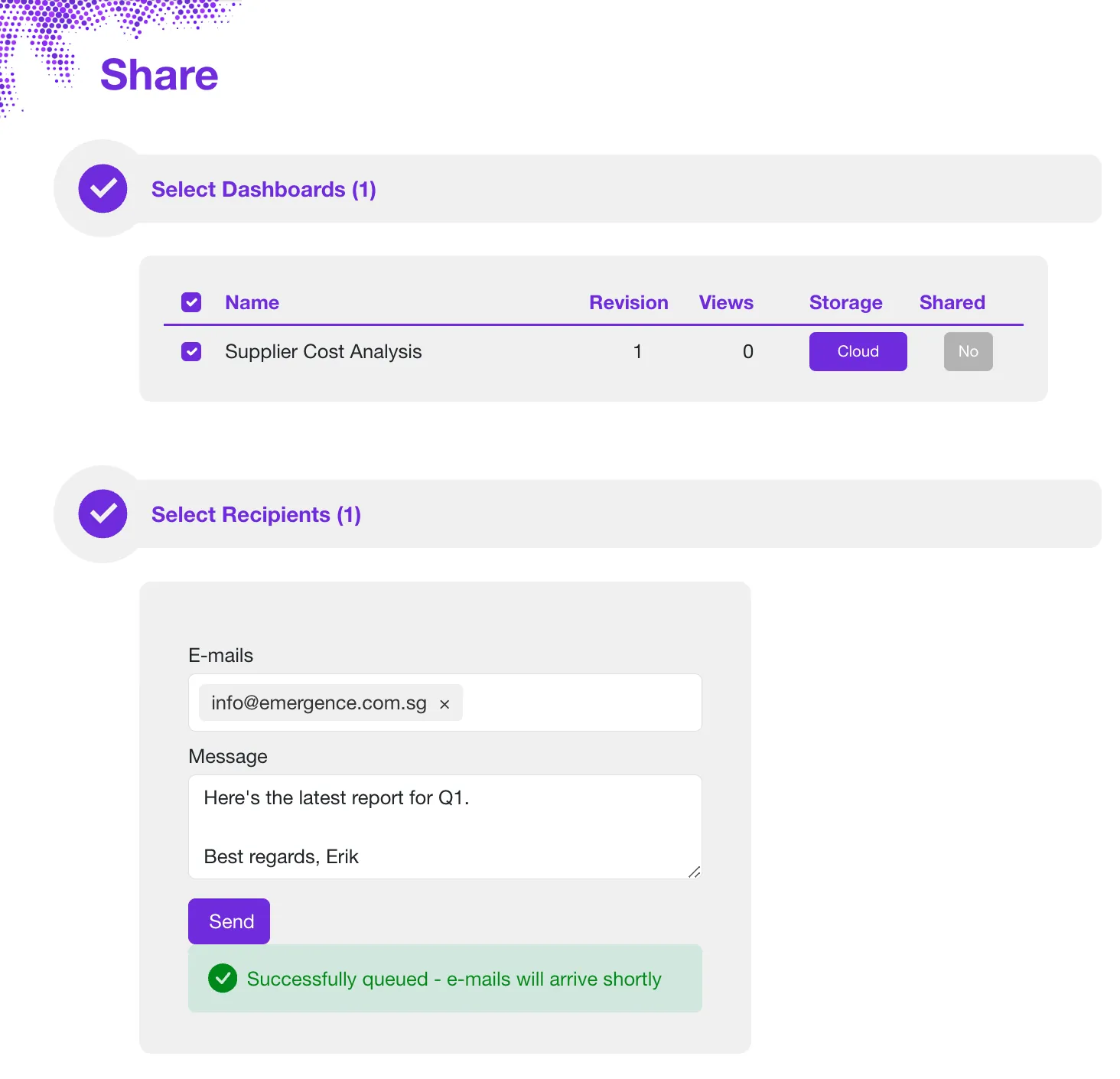
- Step 5: Send - Click on the Send button and Sprucely.io will take care of the rest.
Building the Same Dashboard by Hand in Excel
Excel has everything you need to build simple dashboards without any external tool. It takes four pieces: a clean dataset, a PivotTable for each chart, a PivotChart on top of each PivotTable, and one or more slicers wired to all of them. Here is how to create a dashboard in Excel using only what is already in the application.
Step 1: Lay out a clean, contiguous dataset
Everything downstream depends on this. Put your raw data on its own sheet with a single header row and one row per record — one row per order, per ticket, per transaction. Keep it contiguous: no blank rows or columns inside the block, and nothing else parked beside it. Do not pre-summarize. If you paste in a table that is already grouped by month, you lose the ability to break the numbers down any other way.
Optionally, select the range and press Ctrl+T to convert it into an Excel Table. That is worth doing if you expect to append rows over time, because PivotTables built on a Table pick up new rows when you refresh, instead of you having to redefine the source range by hand.
Step 2: Summarize the data with a PivotTable
Select any cell in your data and go to Insert › PivotTable. Drop the field you want to group by into Rows, and the number you want to measure into Values. Excel defaults to Sum for numbers and Count for text, so check that the summary is the one you meant.
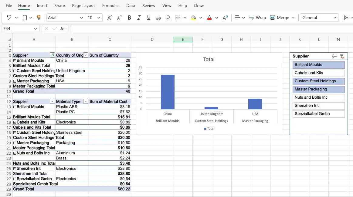
The point that catches people out: you need one PivotTable per chart. A dashboard with four charts and a headline total sits on five separate PivotTables. Build them on their own sheet, out of sight of the finished layout.
Step 3: Turn each PivotTable into a PivotChart
Click inside a PivotTable, open the PivotTable Analyze tab, and choose PivotChart. Pick the chart type that matches the question: a column chart to compare categories, a line chart for a trend over time, a pie chart only when you genuinely mean parts of a whole.
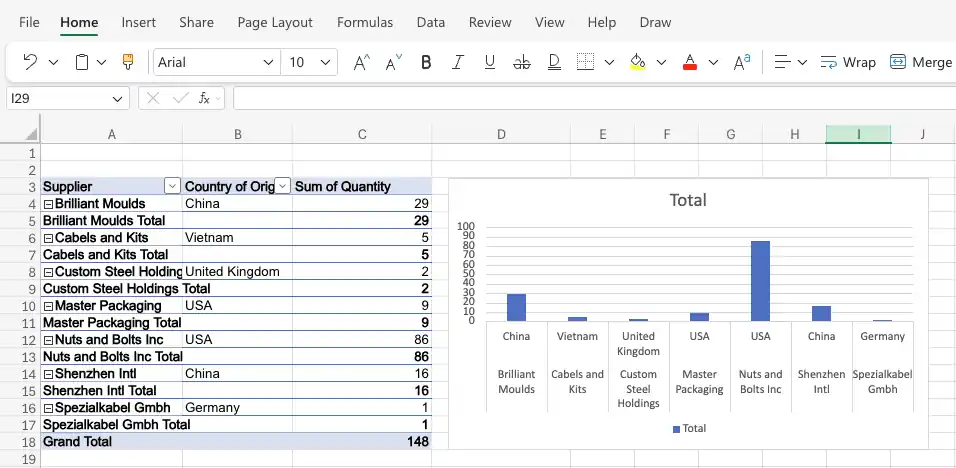
Then format it, because the default is rarely presentable. Remove the gridlines and the chart border, label the series directly instead of leaning on a legend, and check the colors work for viewers with sufficient contrast. Once each chart is formatted, cut and paste them onto a fresh sheet — that sheet is your dashboard.
Step 4: Add a slicer and connect it to every PivotTable
A slicer is Excel’s filter control. Click one of your PivotTables, go to Insert › Slicer, and tick the field you want people to filter by — supplier, region, month, product line. Selecting entries in the slicer filters the chart immediately.
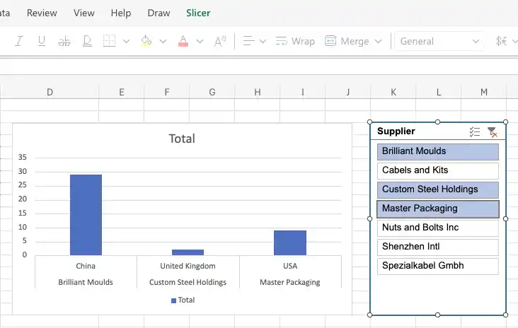
By default that slicer controls only the PivotTable you created it from. To make it drive the whole dashboard, right-click the slicer and open its connections — Report Connections in most desktop versions, or the PivotTable Connections list in the Slicer Settings pane. Tick every PivotTable in the workbook. Now one click filters every chart at once.
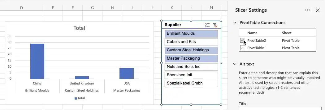
Repeat for each slicer you add. This is the step people forget, and the symptom is unmistakable: you click the slicer and one chart moves while the rest sit still.
With the connections made, the finished sheet holds the PivotTables, the chart and the slicer together, and one selection drives all of them.
Where the manual method gets slow
The build is entirely doable, and for a report you will make once it is often the right answer. Two things make it harder to sustain.
The first is the pivot cache. A slicer can only be connected to PivotTables that share the same source data. If some of your PivotTables were built from a slightly different range — one extra column, one fewer row — they will not appear in the Report Connections list at all, and the fix is to rebuild them from a single common source. If your data genuinely lives on several sheets, a single slicer cannot span them; you need Power Pivot and a relationship between the tables. Microsoft’s own documentation on using slicers to filter data covers the mechanics in full.
The second is that the filter and the chart are separate objects. In Excel you insert a slicer, then connect it to each PivotTable in turn. In Sprucely.io the chart is the filter — click a bar or drag across a line chart and every other chart built on the same sheet responds, with no wiring step, because they share one filter by default. The chart you clicked keeps showing its full range so you do not lose your bearings, and the filtered-out data stays visible as a greyed background layer rather than disappearing. Neither approach is better in the abstract; the difference shows up when a dashboard has to be rebuilt every month.
Designing an Excel Dashboard That People Actually Read
Whichever route you take, the design decisions behind good Excel dashboards are the same. A dashboard is a visual summary of your data — key metrics in one place, so patterns are obvious without scrolling through rows of raw data in a spreadsheet. The best ones answer a specific question without making the reader work for it.
Start with the question, not the chart
Decide what the dashboard has to show before you build anything. What decision does it support? A project dashboard tracking task status and deadlines looks nothing like a sales dashboard tracking revenue against target. Having one clear purpose makes every later choice easier, and it is the difference between a report people check weekly and one they open once.
Choosing chart types
Bar and column charts — comparing values across categories. Sales by region, revenue by quarter, tickets by team.
Line and area charts — trends over time. Monthly growth, seasonal patterns, year-over-year movement.
Pie charts — proportions of a whole, and only that. Market share or budget split. If you have more than about five slices, use a bar chart.
Heatmaps — how two dimensions interact. Sales by month and by region in one grid, where the colour carries the number.
Scatter plots — the relationship between two measures, such as spend against conversions.
Tables — the underlying rows, for people who want to check the number rather than read the shape.
Most dashboards combine several. A line chart for the trend, a bar chart for the breakdown beneath it, and a table at the bottom gives readers both the overview and the detail. For a deeper treatment see our guide on dashboards with data visualization and our dashboard design best practices.
How current does the data need to be?
Worth settling early, because it changes how you build. There are three levels, and most reports only need the first.
Refresh on demand. An Excel dashboard works this way. PivotTables read a pivot cache — a stored copy of the raw data — and the charts move when you refresh, not when the underlying rows change. For a weekly review or a monthly board pack this is fine, and it is the simplest thing to maintain.
Current as of opening. A Sprucely.io dashboard built from a web stream URL re-reads that source every time someone opens it. Nobody has to remember to refresh anything, and the reader always sees the state of the file at the moment they looked.
Genuinely real-time. When you embed a dashboard in your own page with the JavaScript or React integration, your application pushes rows in as they arrive and the charts re-render immediately — no reload, no polling delay. This is the level that matters for operations screens and live monitoring.
The third level is worth a closer look if you are building anything operational, because one detail makes it usable in practice: pushing new data does not reset the view. If someone has filtered the dashboard down to one region and new rows arrive, their filter is recalculated against the combined data rather than cleared. They keep looking at what they were looking at, with the new numbers folded in.
The trade-off is that Sprucely.io does not connect to your database or poll a source on its own — you supply the data, from whatever pipe your application already has. See the integration guide for the code.
Layout that survives contact with readers
Put the number that matters most in the top-left, where people look first. Keep related charts adjacent so the eye does not have to travel. Resist the urge to add one more chart because there is space — a dashboard with four things worth reading beats one with twelve nobody finishes. Use a consistent color palette across every chart, and label axes so the dashboard survives being screenshotted into an email without its context.
Common use cases
Project management — milestones, deadlines, and resource allocation, showing what is on schedule and what is slipping.
Sales and revenue — targets, pipeline stages, and revenue trends compared across regions or products.
Financial reporting — budget against actual spend, cash flow, and margin side by side.
Marketing analytics — campaign performance, traffic, and conversion rates, with period-on-period comparison.
For more on turning these into decisions rather than reports, see our guide on dashboards for business insights.
Excel Dashboard Examples
Most Excel dashboards fall into a handful of recognisable shapes, and it is worth looking at a few before you start building. The two examples below were generated from ordinary tabular exports — one sheet, a single header row, one row per record — and each answers a specific question rather than showing everything the data contains. Both were produced with Sprucely.io rather than drawn by hand, but the layouts are the same ones you would assemble in Excel with one PivotTable per chart. The hand-built version further up shows what that looks like in a workbook.
Supply chain and procurement spend
This one reads the sample supply-chain workbook used throughout this guide. Two heatmaps compare average and peak unit cost across suppliers and cost buckets, a third breaks annual spend down by material type, and a bar chart ranks spend by country of origin. The heatmaps earn their place because there are two dimensions to compare at once — supplier against cost bucket — which a bar chart cannot show without splitting into a dozen panels.
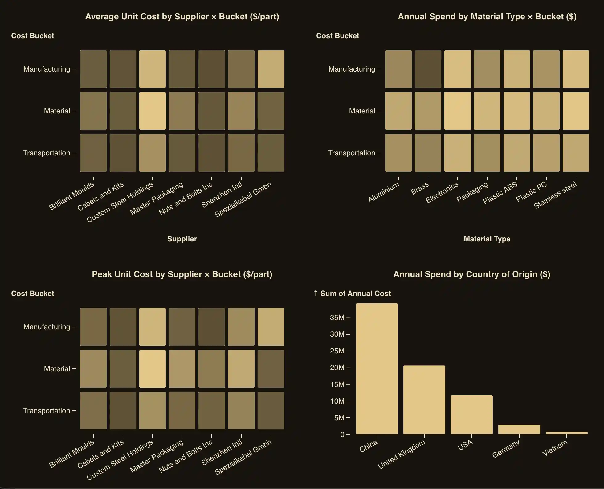
Clicking a supplier column or a country bar filters every other chart on the sheet, which is the behaviour a slicer gives you in Excel once it is connected to all your PivotTables.
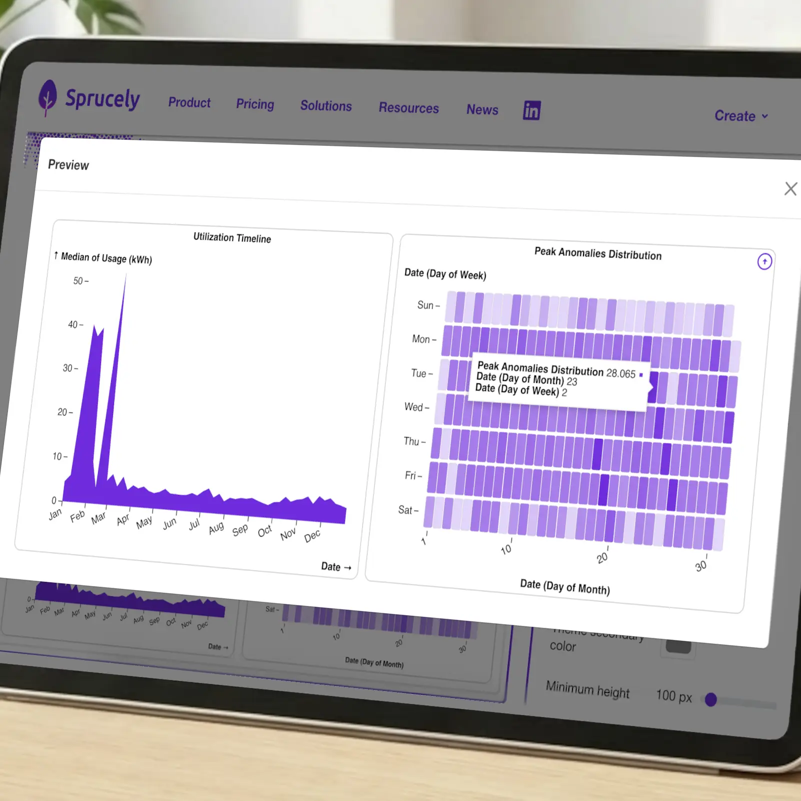
Operations and utilization
A different question needs a different shape. This example tracks usage from a metering export: a timeline for the trend across the year, and a heatmap of peak anomalies laid out by day of week against day of month, so a pattern that repeats every Monday is visible without running a single formula. Interactive Excel dashboards of this kind are the ones most worth publishing rather than emailing, because the reader usually wants to narrow to one period and look again.
Types of Excel dashboards
The rest of what people build from a spreadsheet divides fairly cleanly by the question being asked, and the question decides the charts:
Sales dashboards — revenue against target by region, product or rep. A bar chart for the comparison, a line chart for the trend, a table underneath for the deal-level detail.
Financial dashboards — budget against actual, margin and cash flow. Paired bars for plan-versus-actual, and a running line for the balance.
KPI dashboards — four to eight measures shown against their targets, with the most important one top-left and no chart at all where a single figure says it better.
Project dashboards — task status, deadlines and resource load, usually a stacked bar by status plus a table of what is slipping.
Marketing dashboards — campaign spend, traffic and conversion rate, with period-on-period comparison as the default view.
For layouts you can copy rather than design, see our Excel dashboard templates and the project management dashboard templates. The design section above covers the rules these examples follow.

Conclusion
There are two honest answers to how to create a dashboard in Excel. Build it in the workbook with PivotTables, PivotCharts and slicers, and you keep everything in one file with no other tool involved. Generate a dashboard from Excel instead, and you can let the tool do most of the tedious work for you — Sprucely.io handles the import, the chart selection, and the cross-filtering, so your time goes into refining the report rather than assembling it.
The manual route makes sense for a one-off, or when the file must stay self-contained. Automating it makes more sense when the same report comes round every month, when the people reading it do not have Excel open, or when it needs to live inside a slide deck or a web page.
Sprucely.io works with Excel files, JSON, text files, and web streams, so you can convert Excel to dashboard form whether the data sits on your laptop or behind a URL. If you want to embed the result in a slide deck, follow our PowerPoint dashboard how-to, or browse our Excel dashboard templates for layout ideas to copy into your own Excel dashboards. If you would rather describe the report and have it composed for you, see our AI dashboard generator.
Sign up for free with Sprucely.io to get started. You can also check out our getting started guide first.
This article was first published 11th December 2025 and last updated 5th August 2026.
About the Author

Erik Unemyr
Founder of Emergence Software and the Sprucely.io Platform Lead
Frequently Asked Questions
How do you create a dashboard in Excel?
Build a clean dataset with one row per record, create a PivotTable for each chart you want, add a PivotChart to each PivotTable, then insert a slicer and use Report Connections to link it to every PivotTable. Move the finished charts onto their own sheet and that sheet is your dashboard. The step-by-step walkthrough above covers each stage in detail.
What is an Excel dashboard?
An Excel dashboard is a single sheet that summarizes your data as charts and key figures rather than rows. Instead of scrolling a spreadsheet, you see the metrics that matter in one view. Most Excel dashboards are built from PivotTables so the figures recalculate when the underlying rows change, and interactive ones add filters — slicers in Excel — so readers can narrow the data themselves without editing anything. See the examples above for what that looks like in practice.
Do I need pivot tables to build a dashboard?
For an interactive dashboard in Excel, yes. Slicers only work with PivotTables, and PivotCharts are what slicers filter, so the chain is unavoidable if you want clickable filtering. You can build a static dashboard from ordinary charts and formulas, but readers will not be able to filter it. If you generate the dashboard from your spreadsheet with Sprucely.io instead, no PivotTables are involved — filtering is built into the charts.
Why won’t my slicer filter every chart?
Almost always because the slicer is connected to only one PivotTable. Right-click the slicer, choose Report Connections, and tick every PivotTable you want it to control. If some PivotTables do not appear in that list at all, they were built from a different source range and therefore a different pivot cache — rebuild them from one common range. Data spread across several sheets needs Power Pivot and a relationship between the tables.
How do I create an interactive dashboard in Excel?
Interactivity in Excel comes from slicers connected to PivotCharts, as described above. Add a slicer for each field readers should be able to filter by, connect each one to all your PivotTables, and add a Timeline if you want a visual date-range filter. With Sprucely.io the charts themselves are the filter: click a bar or drag across a line chart and every other chart on the same dataset updates.
How do I create a dashboard in Excel that updates automatically?
In Excel, base your PivotTables on an Excel Table (Ctrl+T) so new rows of raw data are picked up when you refresh, and enable Refresh data when opening the file in PivotTable options. It still refreshes on open, not continuously. In Sprucely.io there are two levels: a dashboard built from a web stream URL re-reads that source every time it is opened, and a dashboard embedded with the JavaScript or React integration updates live — your page pushes rows in and the charts redraw as they arrive.
Can an Excel dashboard show real-time data?
Not in Excel itself. Excel dashboards read from a pivot cache — a stored copy of your raw data — so the charts move when you refresh, not when the source changes. An Excel Table plus refresh-on-open, or Power Query on a timer, shortens the gap but does not close it.
For genuine real-time updates, embed a Sprucely.io dashboard in your own page using the JavaScript or React integration. Your application calls sprucely_add with new rows whenever they arrive and every chart bound to that dataset re-renders immediately — no page reload and no polling interval. Filters survive the update, so a viewer who has drilled into one segment keeps that view as the new data lands. You supply the rows from your own pipe; Sprucely.io does not connect to your database directly. The integration guide has working examples.
How do I create a KPI dashboard in Excel?
A KPI dashboard is a normal dashboard with a tighter brief: pick between four and eight measures that people actually act on, show each against its target rather than in isolation, and put the most important one top-left. Build one PivotTable per KPI, chart the ones that have a trend worth seeing, and leave the rest as plain figures. Fewer, well-chosen KPIs beat a wall of them.
How do I add an Excel dashboard to PowerPoint?
Copying charts into slides gives you a static picture that goes stale. With Sprucely.io, the free PowerPoint add-in from the Microsoft Marketplace lets you paste a dashboard link into a slide and keep it interactive, including in presentation mode. There is an equivalent add-on for Google Slides and Google Docs. Both are listed on the connectors page, and the full walkthrough is in our PowerPoint dashboard how-to.
What kinds of data sources can I use with Sprucely.io?
Excel files, JSON, text files, and web streams. Use a local file via drag-and-drop or the file picker, or point at a web stream URL such as https://www.sprucely.io/supplychain.xlsx so the dashboard re-reads that source when it loads.
How do I import only a specific sheet or range from my Excel file?
In the Configure source step, choose the sheet and set the exact range you want — useful when your workbook has several sheets or you only need part of one. Sprucely.io auto-detects a sensible range from your content, so most files need no manual setup.
Can I customize the dashboard after it’s generated?
Yes. In the Dashboard Editor you can drag widgets to change the layout, swap chart types, and adjust colors through themes or per-widget settings. Each widget’s summary function and styling can be configured individually, and cross-filtering works across every chart built on the same dataset.
How do I share a dashboard, and do viewers need to install anything?
From the Dashboards page, select your dashboard, click Share, enter recipient emails, and click Send. Recipients open the interactive dashboard from a link in their browser. They need no account and install nothing. You can also embed the same dashboard in a web page, a PowerPoint slide, or a Google Slides deck.